How many social networks are you on? There are plenty out there, like:
| Google+ | ||
| FourSquare | Tumblr | |
| Flickr | MySpace |
Now, how do you interact with everyone on each of your social networks?
If you're a small business, then knowing the demographics of the people online should definitely be a priority. Tailoring your social marketing efforts towards these demographics will hopefully increase your conversion rates and help you understand the importance of knowing your audience. Here's some insight into the demographics on the a few social networks.
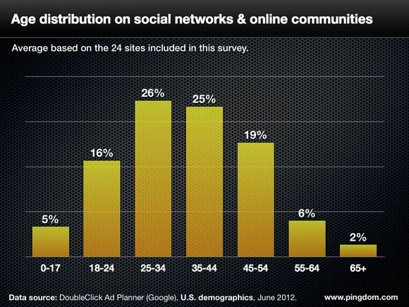

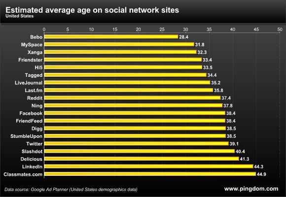
While I enjoy looking at infographics to help me get a broad understanding, I've simplified it down to the top 5 social networks (in the United States) for which small businesses should take notice.
Facebook:
(stats are based on population aged 12+ .... http://www.slideshare.net/webby2001/the-social-habit-2012-by-edison-research)
- 54% of the American population has a Facebook profile (up 3% from 2011)
- Avg. of 143 million Americans!!!
- 1/2 of these users are 45+ and make on average annually $55,000
- 25% of users check their personal profile page at least 5x daily
- 47% of population influenced on purchase decision from Facebook
- In 2011, only 24% said Facebook influenced their buying decision...HUGE INCREASE!
Twitter:
(stats are based on population aged 12+ .... http://www.slideshare.net/webby2001/the-social-habit-2012-by-edison-research)
- 10% of population on Twitter (up 2% from 2011)
- Avg. of 26 million Americans
- 29% of users are using their accounts multiple times daily
- This is up 11% from 2011, a SIGNIFICANT increase in usage ... TAKE NOTICE!!
- INFLUENCERS are on here. Reach out to influencers to help you spread your brand BUT don't become a spammer!
Pinterest:
- 60% of users are Female
- This is NOT TRUE in other countries, example..UK Pinterest users are 56% MALE!
- 29% are btwn the ages of 35-44
- HUGE DRIVER OF REFERRAL TRAFFIC!
- Pins should give DIRECT URL to products
- FASTEST growth of a social networking platform EVER!
Google+:
(stat info taken from the Chase BIS event with speaker Tim Sanders http://timsanders.com)
- 67% of users are Male
- 42% are single
- 20% are students
- Engineers are the 2nd highest occupation
- In my personal opinion .... jump on this bandwagon now & start building ASAP. I think this will take off pretty quickly since BUSINESS PAGES have just launched.
LinkedIn:
(stats are based on population aged 12+ .... http://www.slideshare.net/webby2001/the-social-habit-2012-by-edison-research)
- 71% of users are most likely to have a 4-year College Degree
- Average annual income of a LinkedIn user is $109,000
- Tip ... most businesses don't see the value of LinkedIn for their business. Depending on your business though, networking can help increase drive and you should utilize this site to drive traffic to your business website. These users have $$$$$!
